Project
Branding
Client
Rock Sterre Festival
Rock Sterre - Branding
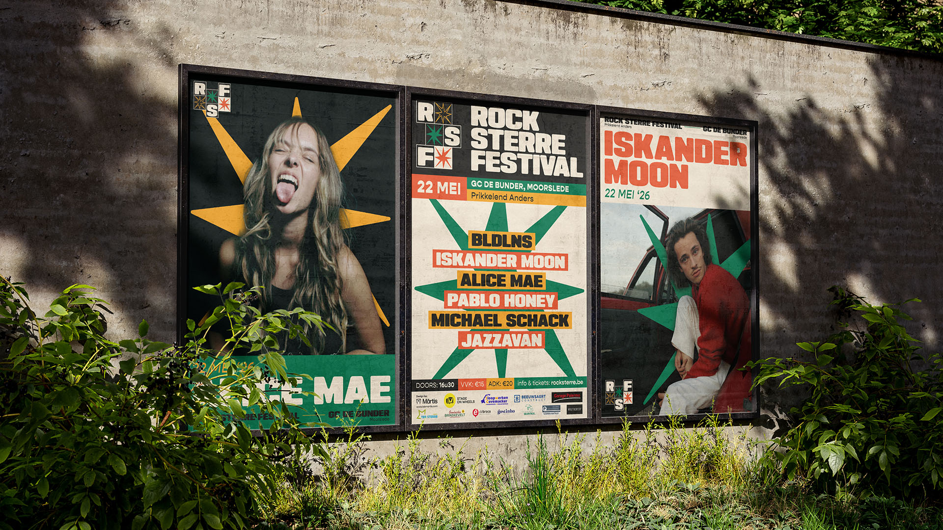
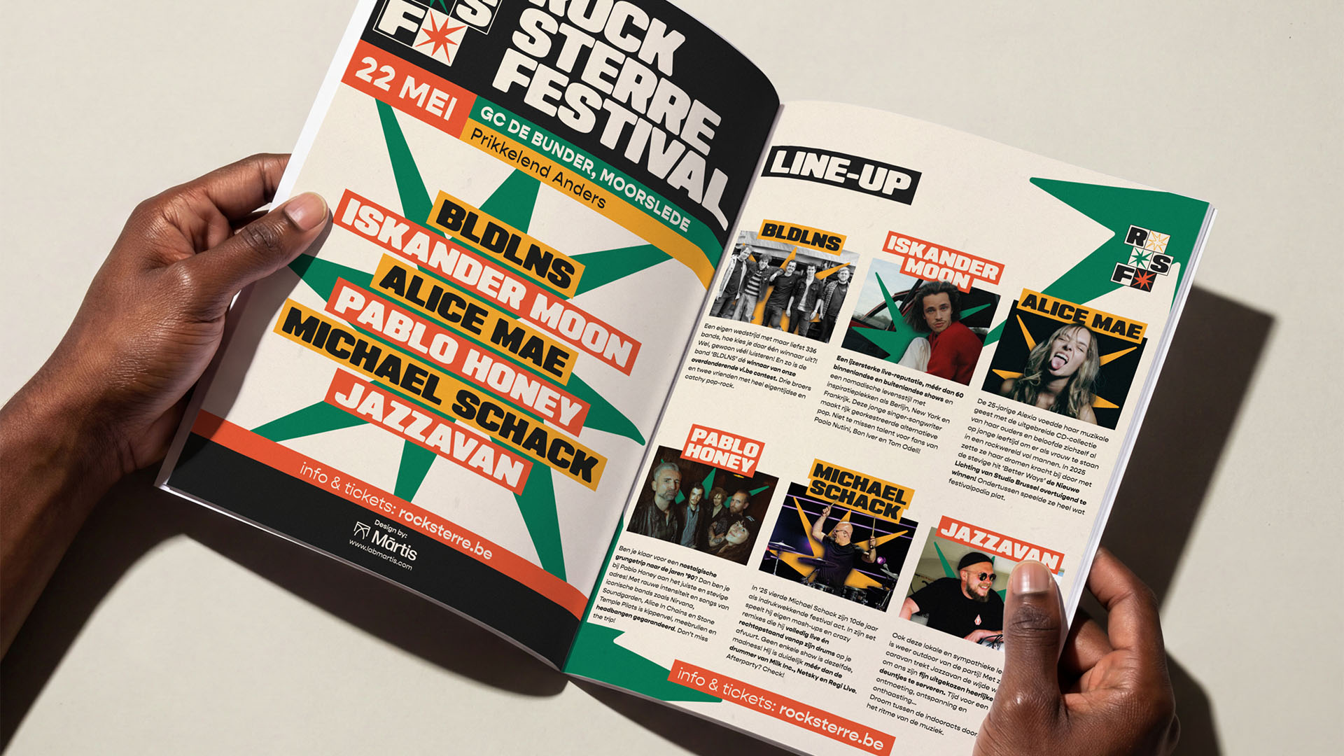
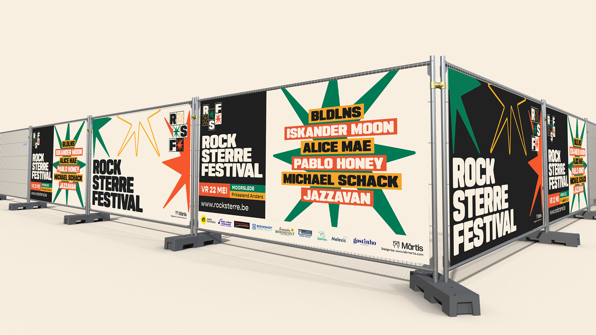
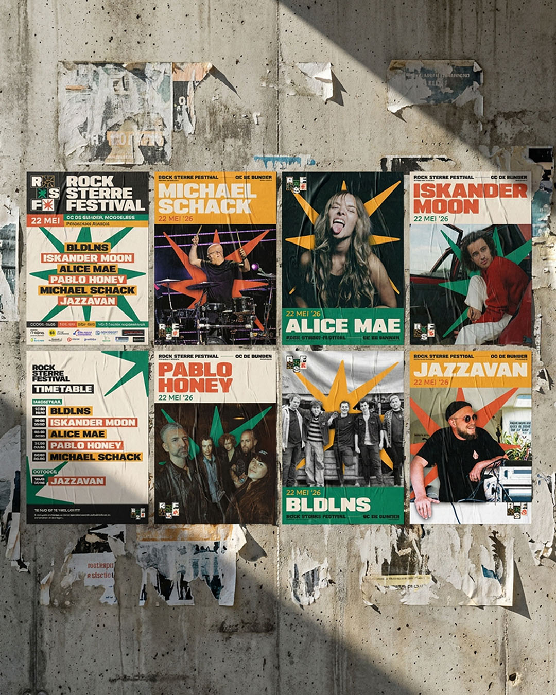
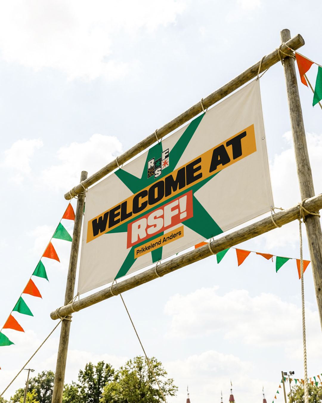
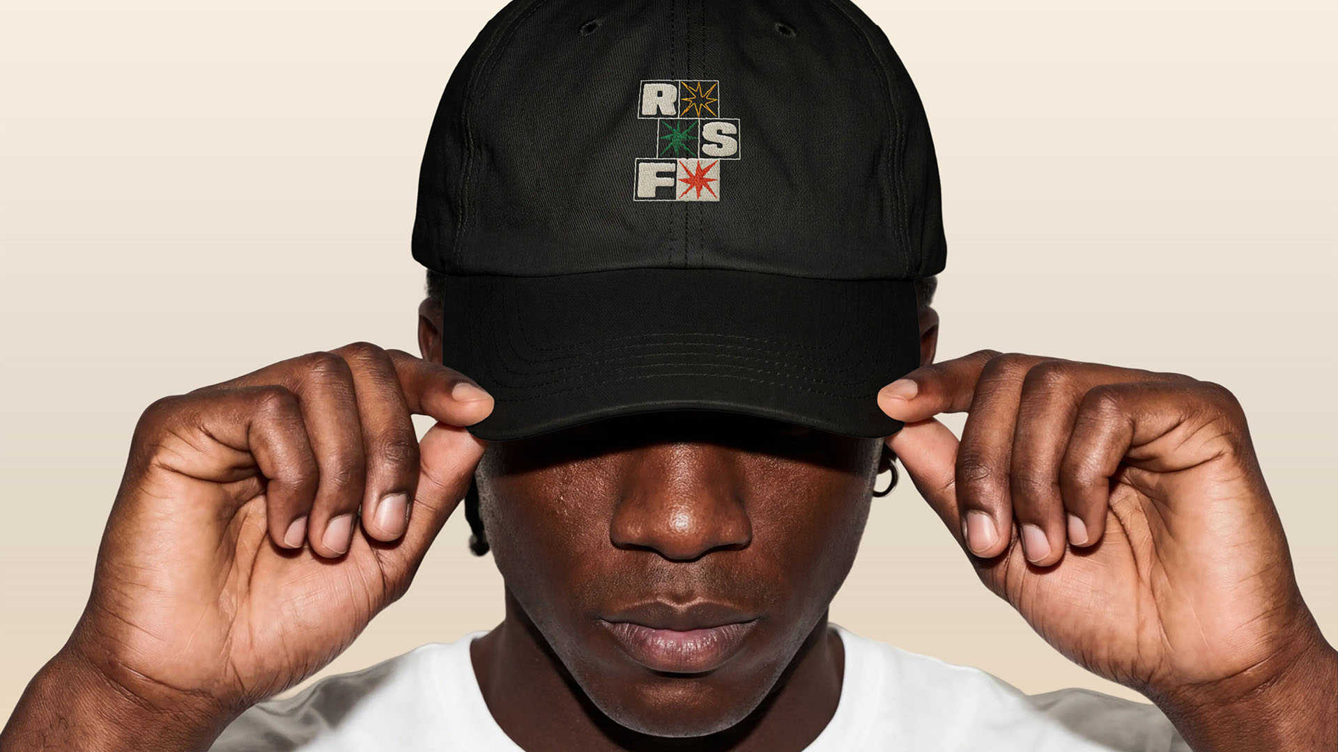
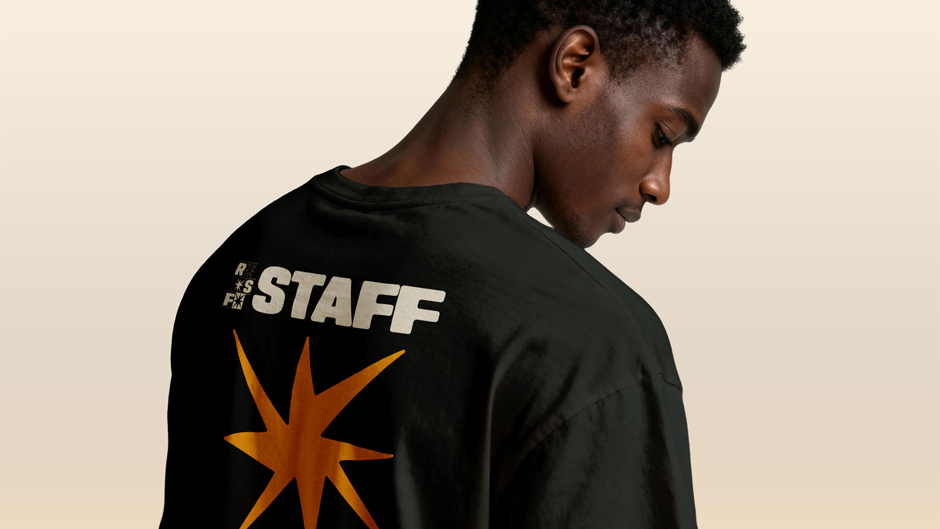
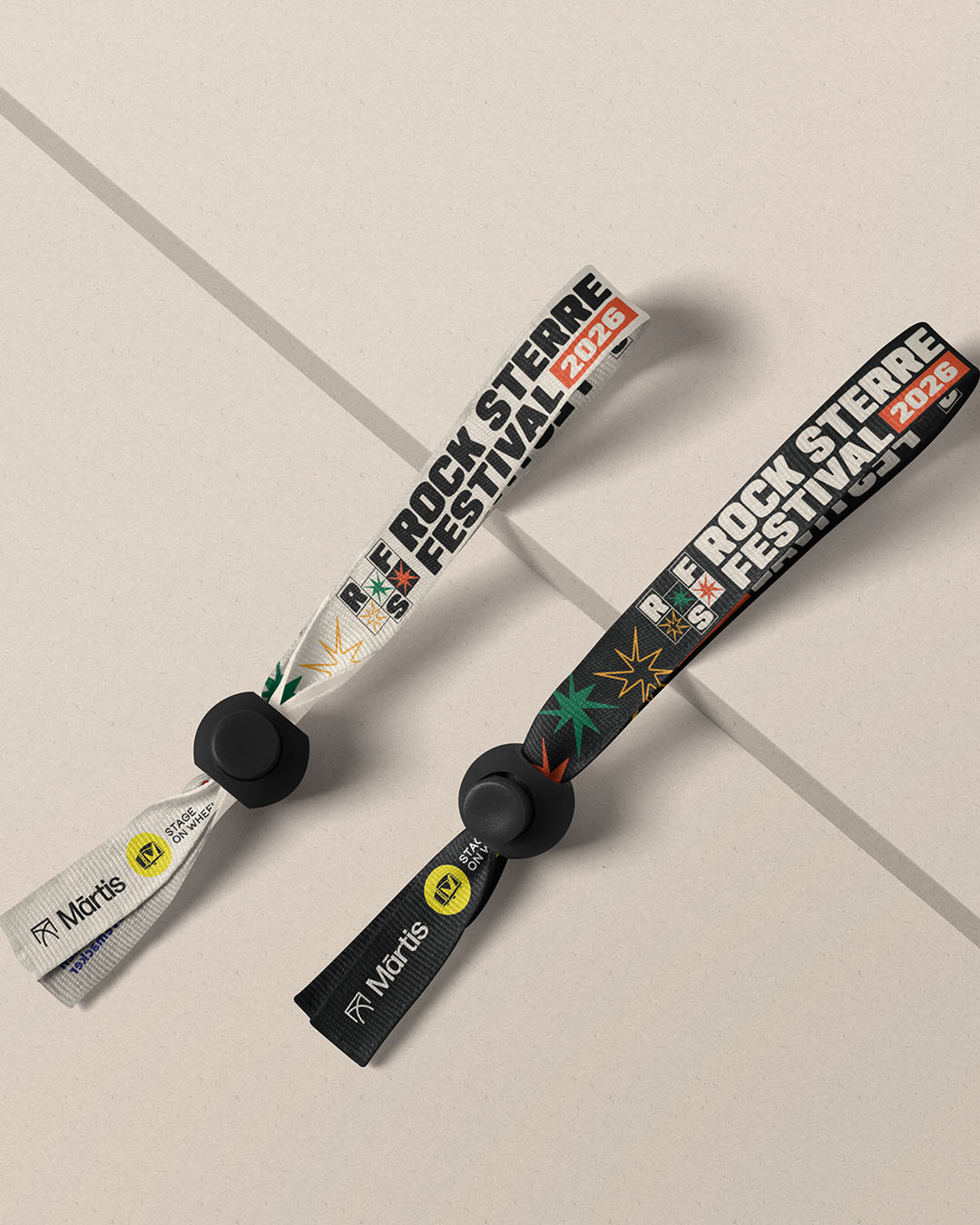
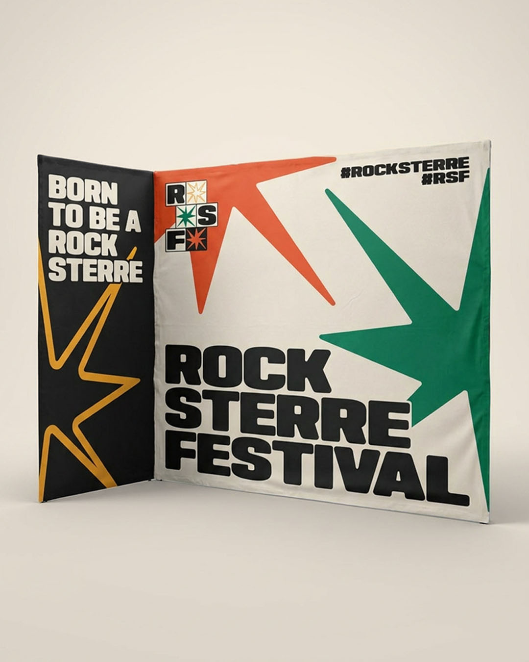
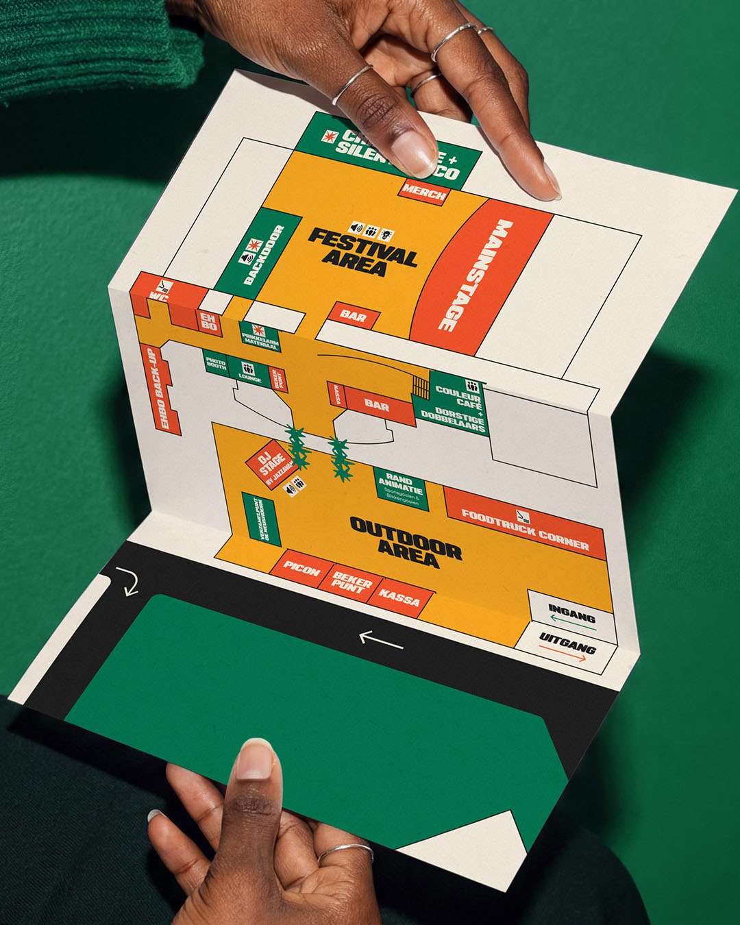
Rock Sterre Festival is a branding project created for a unique Belgian autism-friendly music festival, built around the idea that everyone should be able to experience live music in their own way. The visual identity balances energy and accessibility. Bold typography, expressive star elements and high-contrast compositions capture the vibrant atmosphere of a festival, while the structured layouts and recognisable visual system help create clarity and reduce overstimulation. The branding was designed to feel loud and exciting without becoming visually chaotic. A key part of the concept revolves around the “Rock Sterre” star symbol. Inspired by the idea of sensory impulses and connection, the star becomes a recurring visual language throughout the identity. Combined with a warm, playful colour palette and modular compositions, the system feels expressive, approachable and easy to navigate across both print and digital applications. The project was developed far beyond just a logo. The branding was translated into a full festival ecosystem including merchandise, posters, social media visuals, motion graphics, wristbands, signage, tickets, editorial layouts and environmental applications. Every touchpoint was designed to feel consistent, accessible and instantly recognisable.